Marian’s Dream
Mariam's Dream, a non-profit organization dedicated to preventing pet overpopulation for the past 40 years, is currently hindered by an outdated website
OVERVIEW
Project type: Website Analysis and Updation
Role: UX/UI Designer (Project lead)
Industry: Non-Profit - Animal Welfare
Tools: Figma, FigJam, Zoom, Miro, inVision
PROBLEM
-
Outdated Content and Aesthetics
-
Performance and Accessibility Challenges
SOLUTION
Updating the UX/UI of the old website to improve user engagement and make the site feel modern and more user-friendly.
Marian’s Dream
DEFINITION & IDEATION
Objective: Definition and Ideation phase play key roles in transforming the insights gathered during user research into tangible solutions that guide the design of the website
USER RESEARCH
Objective: Understand the current user experience and identify key areas for improvement on the outdated website.
Design Retrospective
We learnt two main lessons from this project:
-
User Feedback is Essential: We learnt that continuously testing and iterating based on real user feedback was essential. It helped us identify key pain points early and enabled us to design a truly user-centered website.
-
Simplicity Drives Engagement: We also realized that simplifying navigation and declutteri greatly improved the overall user experience. It helped users achieve their goals and boosted website engagement.

Persona
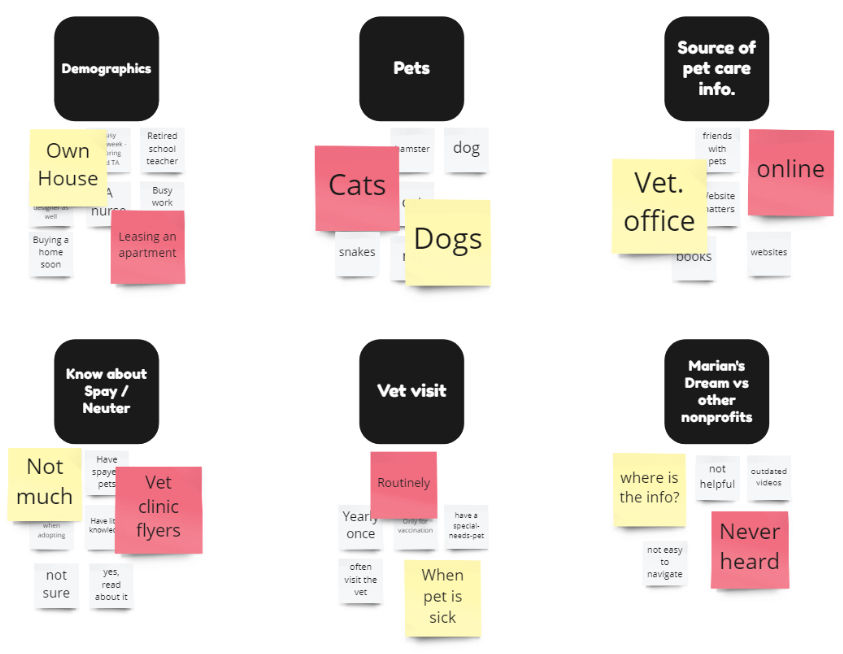
Based on our user research we created the persona of Katy Lake. We used her persona to better understand the needs, behaviors, goals, and pain points of target audiences. This helped guide our design decisions and ensure the website met the needs of real users.

PROTOTYPING
Objective: To visualize how the website will work, allowing for testing, feedback, and refinement before the final design is built.

UX UI Design Goal
-
Better User Experience: Updated content, easier navigation, and a modern design to encourage longer visits and repeat traffic.
-
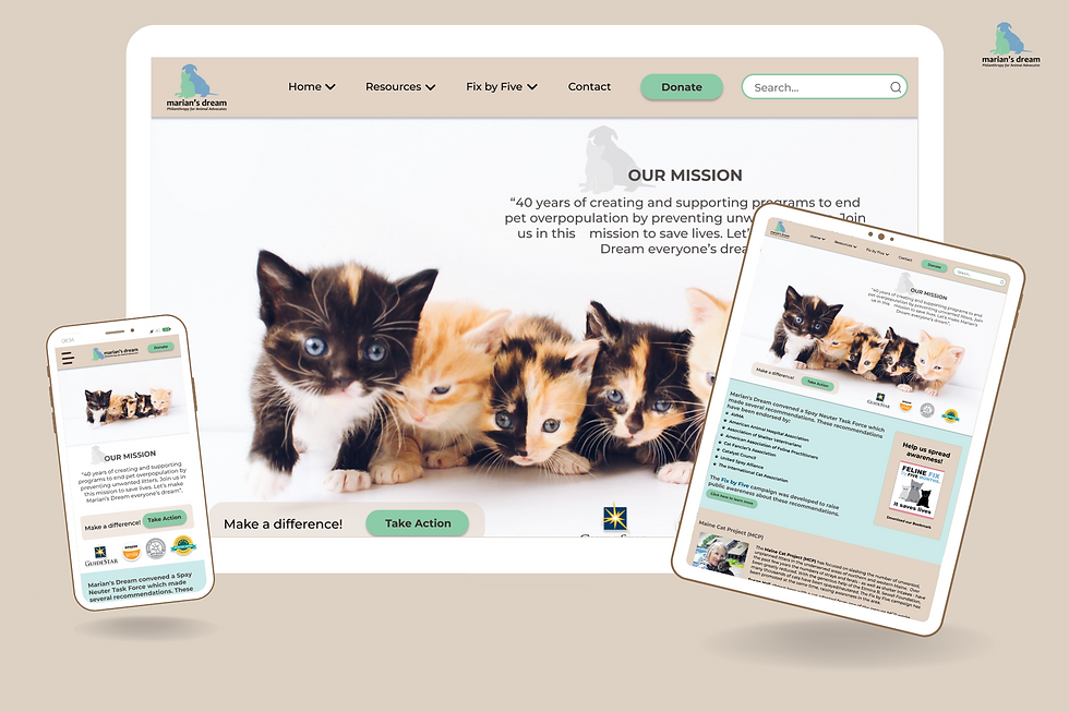
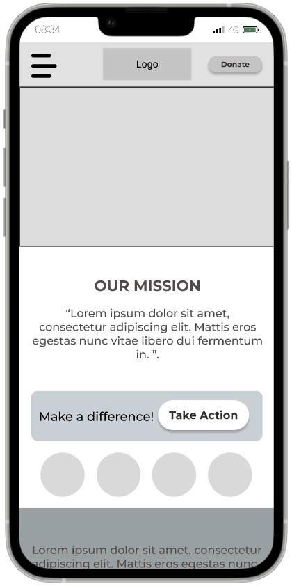
Mobile Optimization: A responsive design to ensures the site works well on all devices, increasing reach.
Methodology
UX/UI research methodology is essential for understanding users' needs, behaviors, and pain points to design a more effective, user-centered website.
User Research
-
Conduct User Interviews to understand user needs, behaviors, and pain points.
-
Conduct a Heuristic Evaluation to identify usability issues in a user interface.
-
Develop User Personas to represent the key audience segments.
Definition & Ideation
-
Use an Empathy Map to gain insights into how users think, feel, say, and do.
-
Employ a Priority Matrix to prioritize tasks, features, or issues.
-
Design Information Architecture and Style Guide that helps users find information quickly, easily and intuitively.
Prototyping
-
Create Sketches, Mid-fidelity (mid-fi) wireframes, and High-fidelity (high-fi) prototypes to help visualize the structure and user interactions before finalizing the website design.
Testing & Iterating
-
Testing and Iterating the design to ensure it is effective, user-friendly, and aligned with user needs
Stakeholder & User Interviews
-
We conducted stakeholder interviews to understand the business, target audience, and pain points that need addressing, that included: Business Goals, User Experience, Design, Functionality, and Content.
-
Then conducted 11 user interviews to obtain: Direct User Insights, Contextual Understanding, and Rich Qualitative Data.
Heuristic evaluation
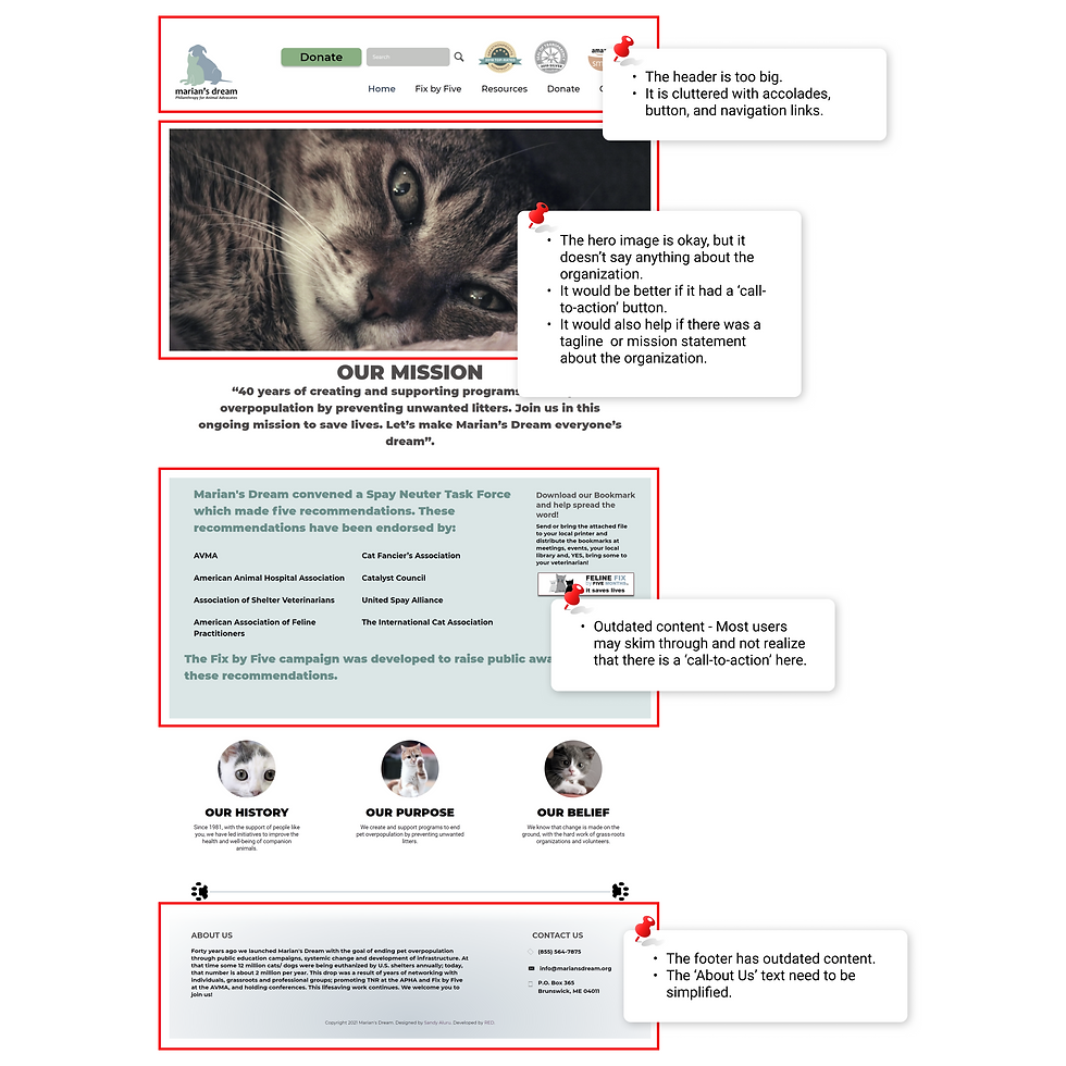
Heuristic evaluation helped us identify various design and usability issues in the outdated website by applying established usability principles. It uncovered flaws caused by changes in technology, user expectations, and design trends:
-
Outdated and Cluttered content
-
No clear navigation and logical hierarchy
-
Non-responsive website design
Insights gained
Mobile first
The non-responsive website design leading to higher bounce rates, lower user engagement, and a negative impact on search engine rankings
UI
The outdated User Interface was impacting usability, user satisfaction, and conversion rates, making a redesign crucial.
Accessibilty
Had to enhance accessibility, clarify CTAs, and maintain consistent branding (especially, typography and colors) to improve user engagement and trust.
Content
The outdated content was leading to loss of credibility, confusion and misinformation, and poor User Experience

Empathy Map
An empathy map helped our team understand our users better by focusing on what the user thinks, feels, sees, and does. It helped us better understand Katy Lake, our persona, and her pains and needs:
She feels frustrated when websites are difficult to navigate and when it takes too long to find resources.
She needs simple, quick access to the reliable information and actions she’s looking for.
She needs a website that allows her to quickly learn about pet-care and volunteering, with a mobile-friendly design that makes everything easy to access.
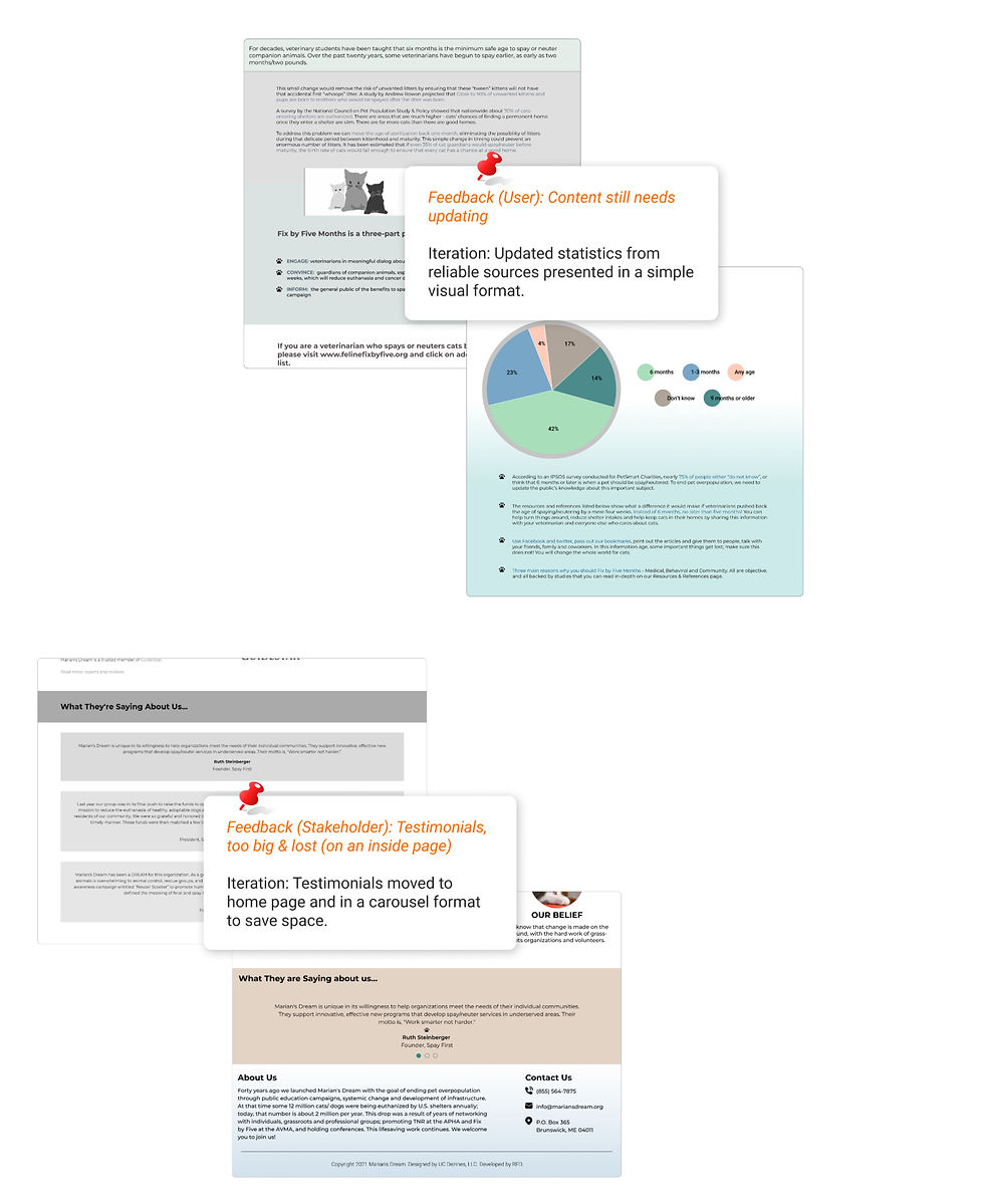
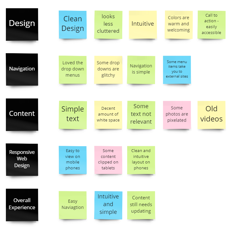
Usability Testing
We conducted usability tests with users to evaluate how well the website's structure, layout, and core interactions align with user needs and expectations (before advancing to high-fidelity design or development).
We were also iterating, making continuous improvements and refinements based on feedback, testing, and evaluation of the mid-fi wireframes.
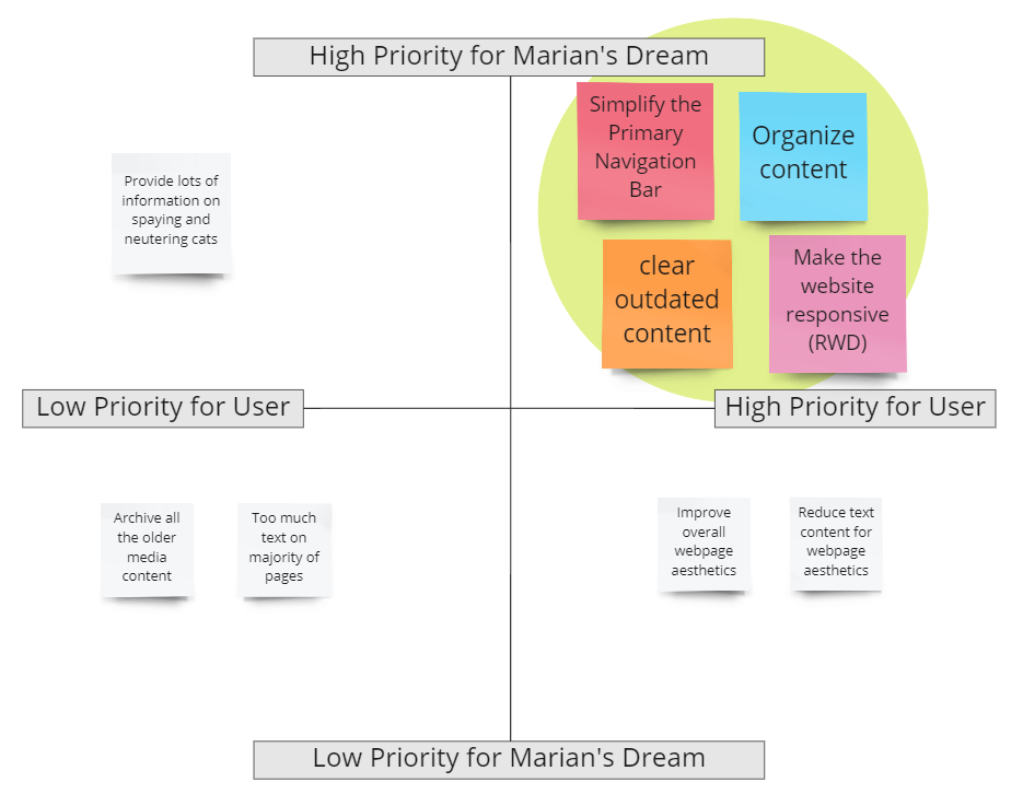
Priority Matrix
We employed a priority matrix helps prioritize features or tasks based on their impact and effort, allowing the design team to focus on what matters most for the website redesign.
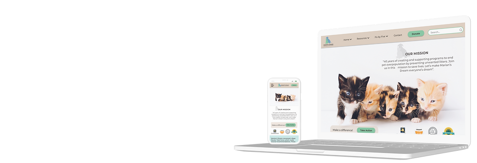
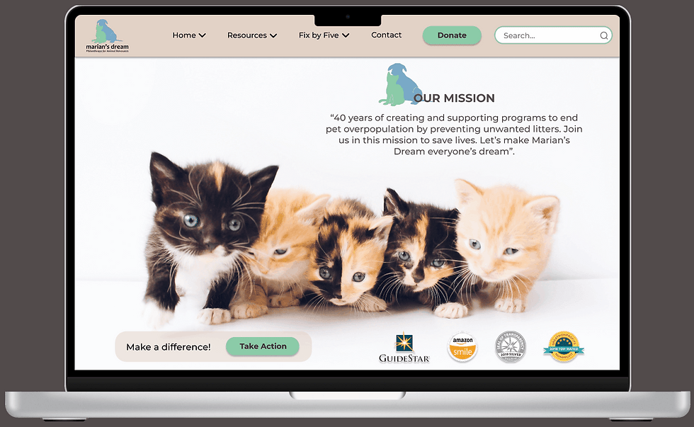
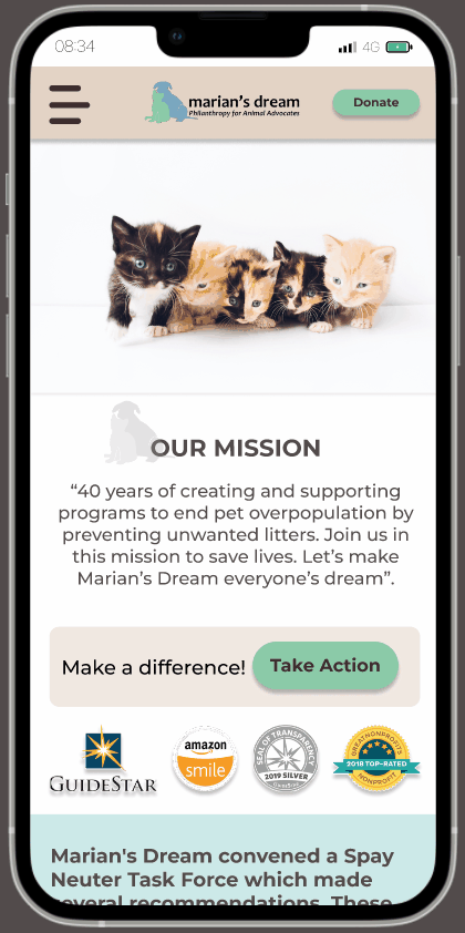
Final Product
The final redesigned MARIAM'S DREAM website offers an intuitive, user-friendly experience with streamlined navigation, responsive design, and updated content. With enhanced accessibility and functionality, it is now easier for users to engage with the organization’s mission and take action.
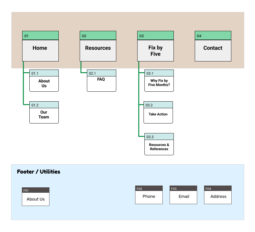

Information Architecture
We restructured the IA to ensure that our users can easily find the information they need. It involved - organizing, labeling, and structuring content in a way that makes sense for our user and helps them navigate the site effortlessly.
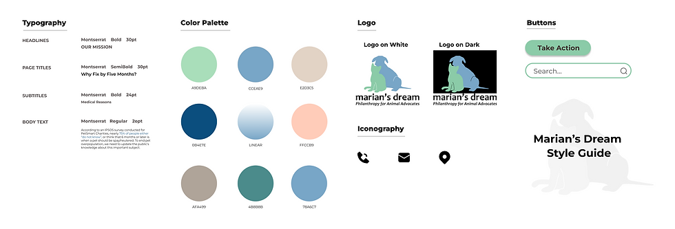
Style Guide
Our team created a style guide the website to ensure consistency in visual and textual elements across the platform, creating a cohesive brand identity and enhancing the user experience.
This style guide also served as a reference to maintain a consistent, accessible, and engaging user experience across the website, ensuring that all visual and content elements align with the non-profit’s mission and values.
Low Fidelity Sketches
Sketching allowed us to quickly visualize ideas and experiment with layouts before moving into digital design. For our non-profit website like the one focused on ending pet overpopulation, sketching helped explore different layouts, navigation structures, and content placement.
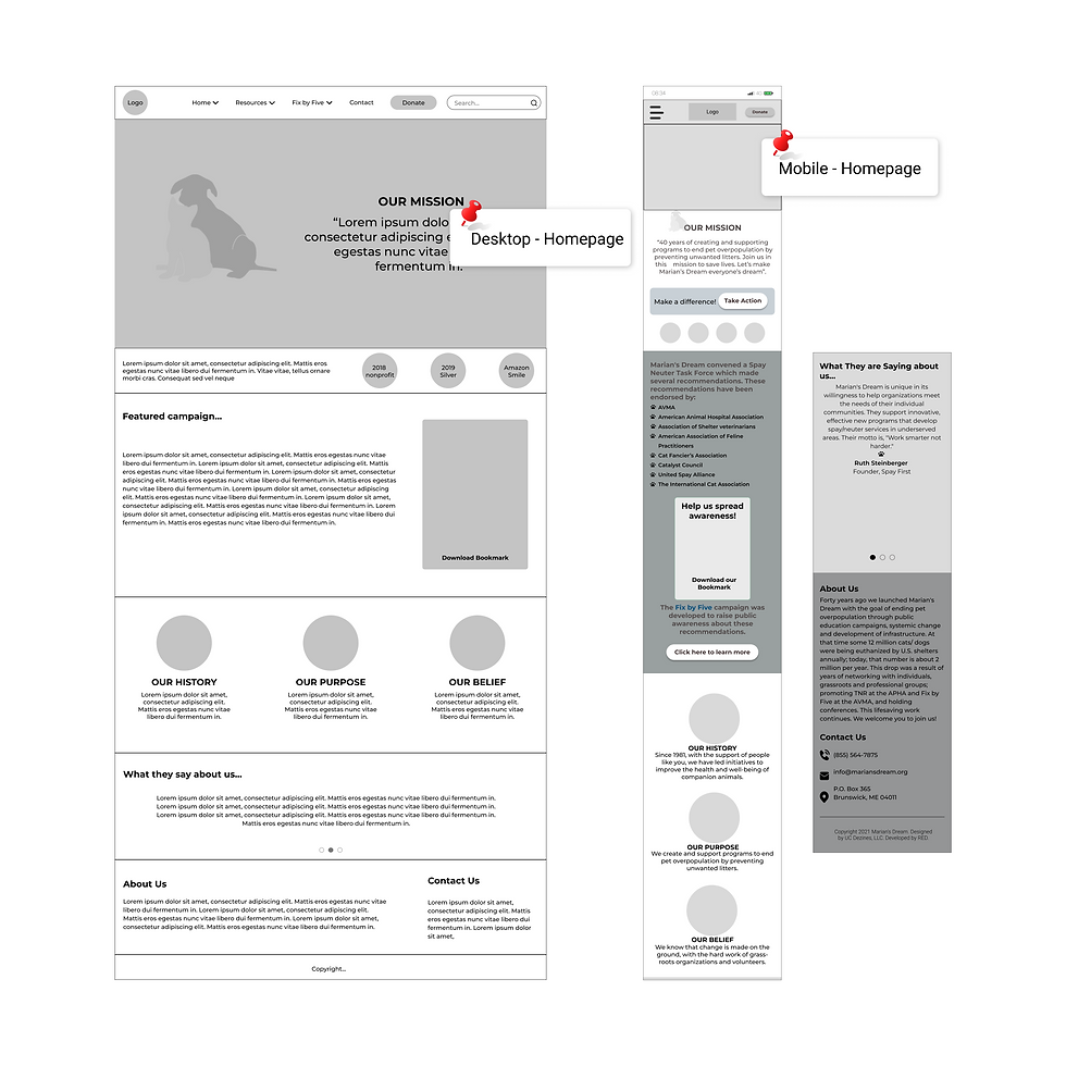
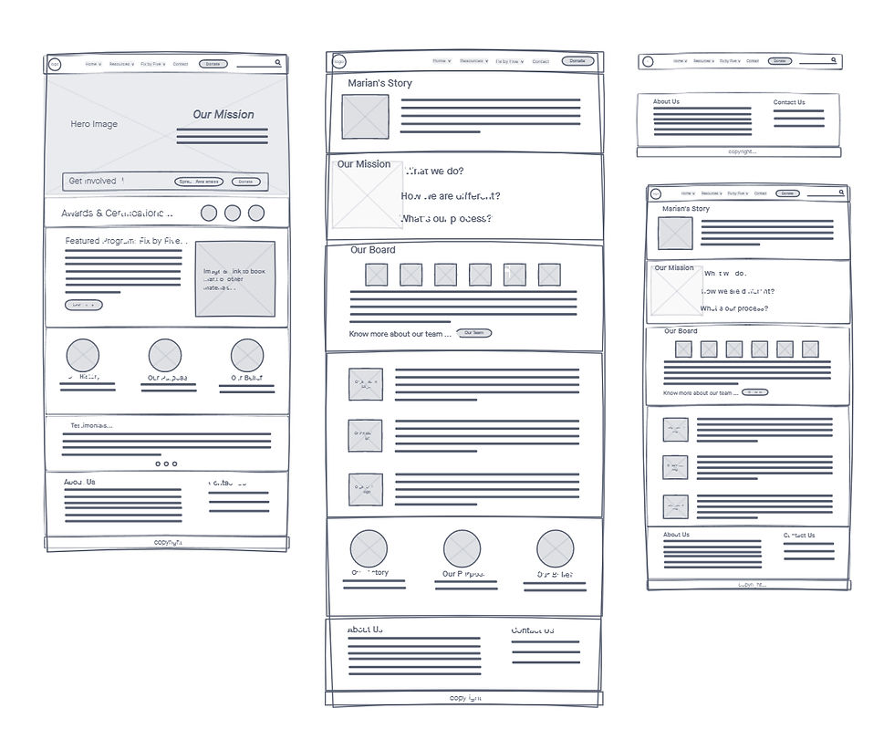
Prototyping - Mid Fidelity
At this stage, our design included more specific details like spacing, typography, and more defined layouts, but it still avoided detailed styling and content. The purpose of mid-fi wireframes was to focus on functionality, usability, and overall structure without getting caught up in the finer visual details.

Testing & Iterating
The goal of testing and iterating at this stage (mid-fi) was to identify potential issues with navigation, layout, content hierarchy, and overall usability before investing in more detailed designs.
We focused on the following, during testing:
-
Navigation and User Flow
-
Content Hierarchy and Readability
-
Interactivity and Feedback
-
Task Completion
Test Insights
Findings from the usability testing:
-
Users struggle to find key pages
-
Users are unsure of where to click to donate
-
Users feel overwhelmed by too much text or information on certain pages
-
On several pages, users have difficulty distinguishing between primary and secondary information