
OVERVIEW
Project type: Landing Promotion Page using Shopify
Role: UX/UI Designer (Project lead)
Industry: Wearables Ecommerce Website
Tools: Figma, FigJam, Zoom, Miro.
PROBLEM
-
Need to reach out to their target audience soon through a promotional landing page.
SOLUTION
Design an attractive and approachable landing page with videos and animations to promote my client's products. Initially design in Figma to quickly convert their specifications into simple micro animations and upload to Shopify template.
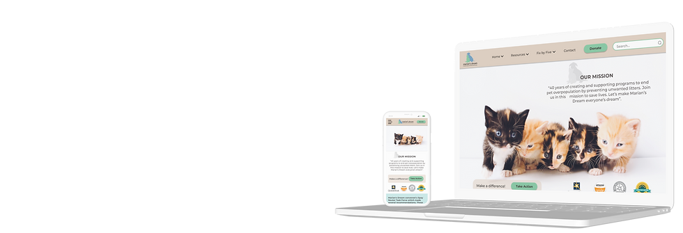
Marian’s Dream

Core Impact, inc
A Shopify landing promotion page to promote my client's new wearable collections.
UX UI Design Goal
-
Promo Landing Page: Design a promotional landing page to showcase my client's wearables for upcoming Core Impact event on Shopify.
-
Connect with target audience through the landing page and signup for the event: Design a connect section for prospective customers to sign up for the event and get a glimpse of the products on Shopify.
Methodology
UX/UI design methodology is essential for understanding users' needs, behaviors, and pain points to design a more effective, user-centered website.
Prototyping
-
Create Sketches, Mid-fidelity (mid-fi) wireframes, and High-fidelity (high-fi) prototypes to help visualize the structure and user interactions before finalizing the website design.
Testing & Iterating
-
Testing and Iterating the design to ensure it is effective, user-friendly, and aligned with user needs
USER RESEARCH
Objective: Understand Shopify website to design a customized promotional campaign landing page for an upcoming company roadshow.
Stakeholder Interviews
-
We conducted stakeholder interviews to understand the business, target audience, and pain points that need addressing, that included: Business Goals, User Experience, Design, Functionality, and Content.
-
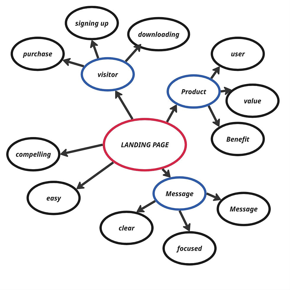
The landing page for Core Impact needs to instantly grab attention, build trust, and drive conversions—whether that’s purchases, email signups, or app downloads.
Insights gained
Concept Visual
Give visitors a first look at what’s coming and helps them visualize the product.
Mockup of App
Build excitement for how the full ecosystem (gadget + app) will work.
Performance Promise
Set expectations and communicates the benefit clearly — even without a finished product.
Pre-Order / Early Access
Builds exclusivity and urgency to get on board early.
DEFINITION & IDEATION
Objective: Definition and Ideation phase play key roles in transforming the insights gathered during user research into tangible solutions that guide the design of the website
Style Guide
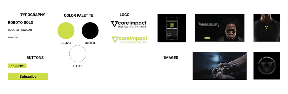
Our team created a style guide to enhance the brand's message and user experience, especially for a futuristic sports performance gadget. The green and black color palette gives off a high-tech, high-energy, performance-first vibe. It is common in sportswear and performance branding and signals intensity, focus, and progression — perfect for a product that helps athletes level up.
PROTOTYPING
Objective: To visualize how the website will work, allowing for testing, feedback, and refinement before the final design is built.
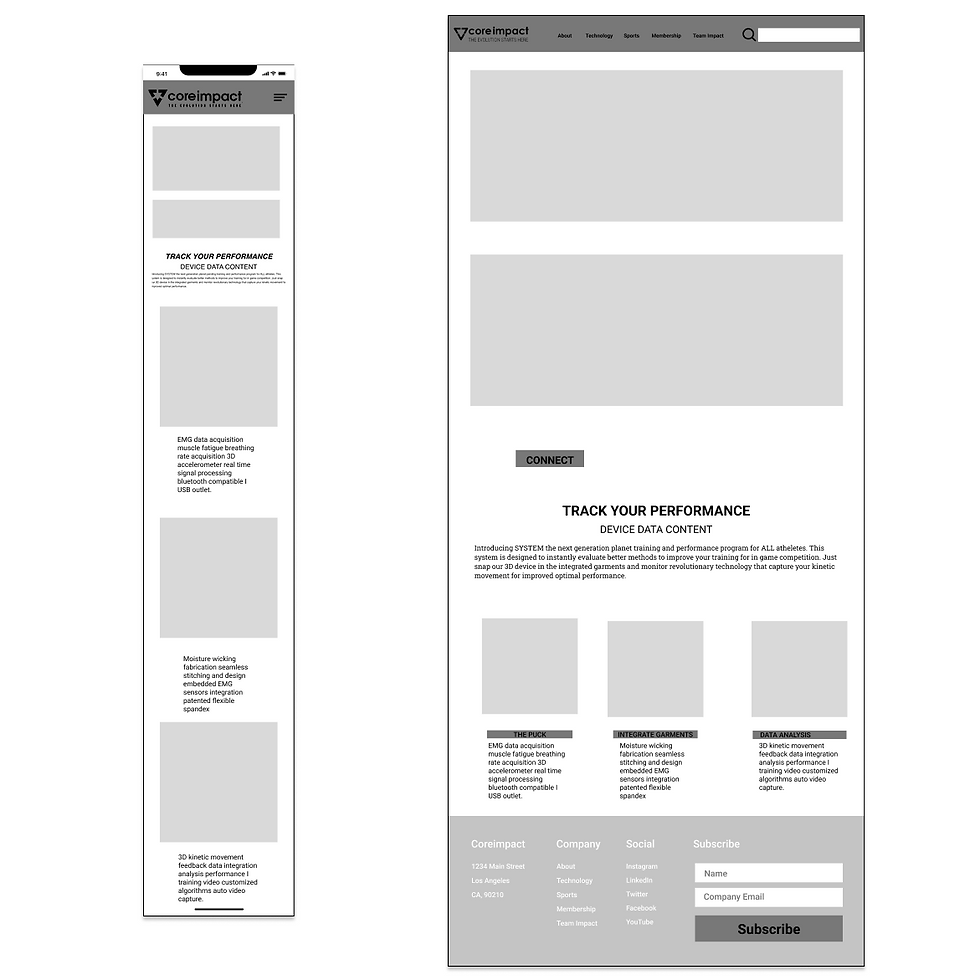
Prototyping - Mid Fidelity
At this stage, our design included more specific details like spacing, typography, and more defined layouts, but it still avoided detailed styling and content. The purpose of mid-fi wireframes was to focus on functionality, usability, and overall structure without getting caught up in the finer visual details.
Test Insights
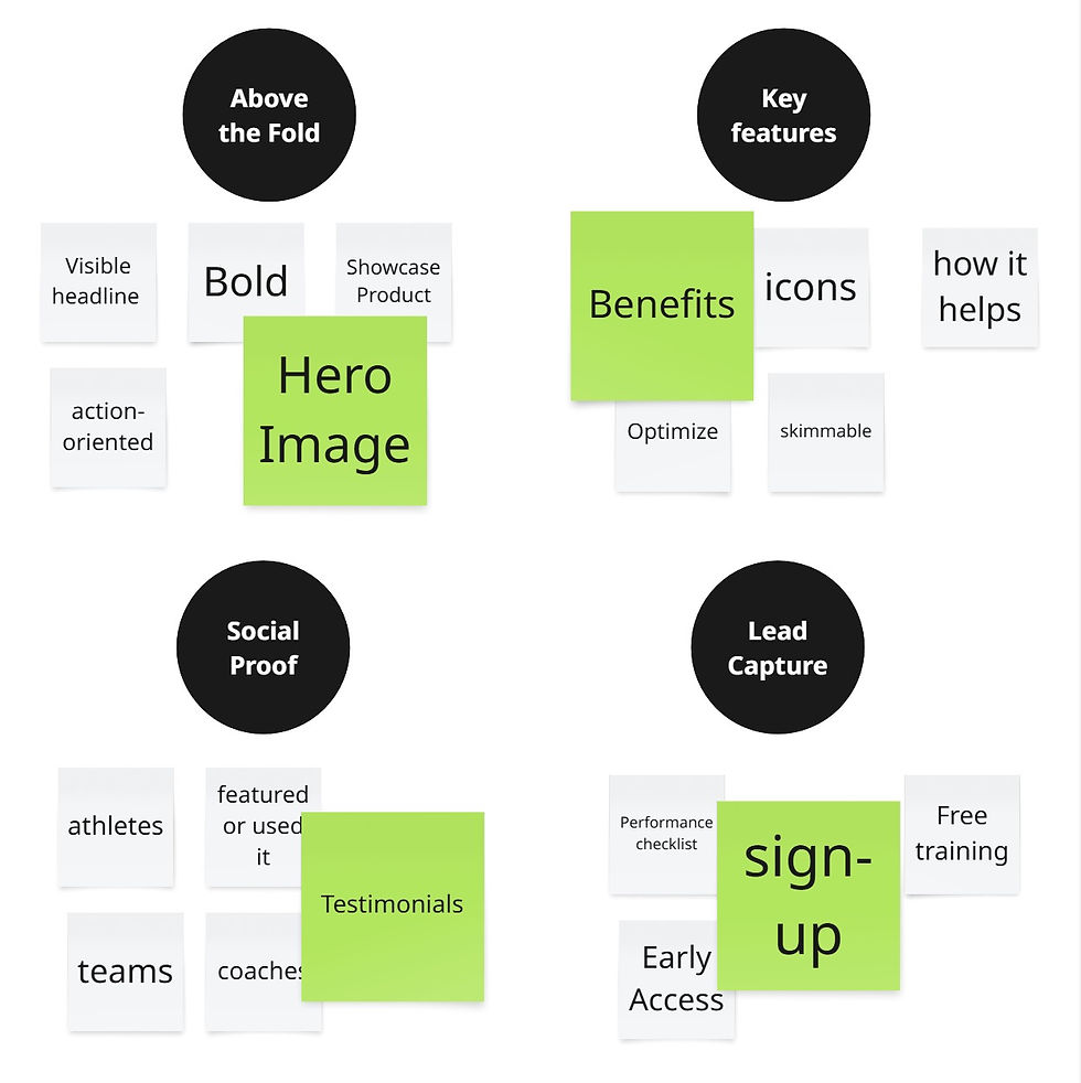
Findings from the usability testing:
-
Too many features confusing users.
-
The CTA doesn’t seem to motivate the user to act.
-
Not enough proof that the product is trustworthy.
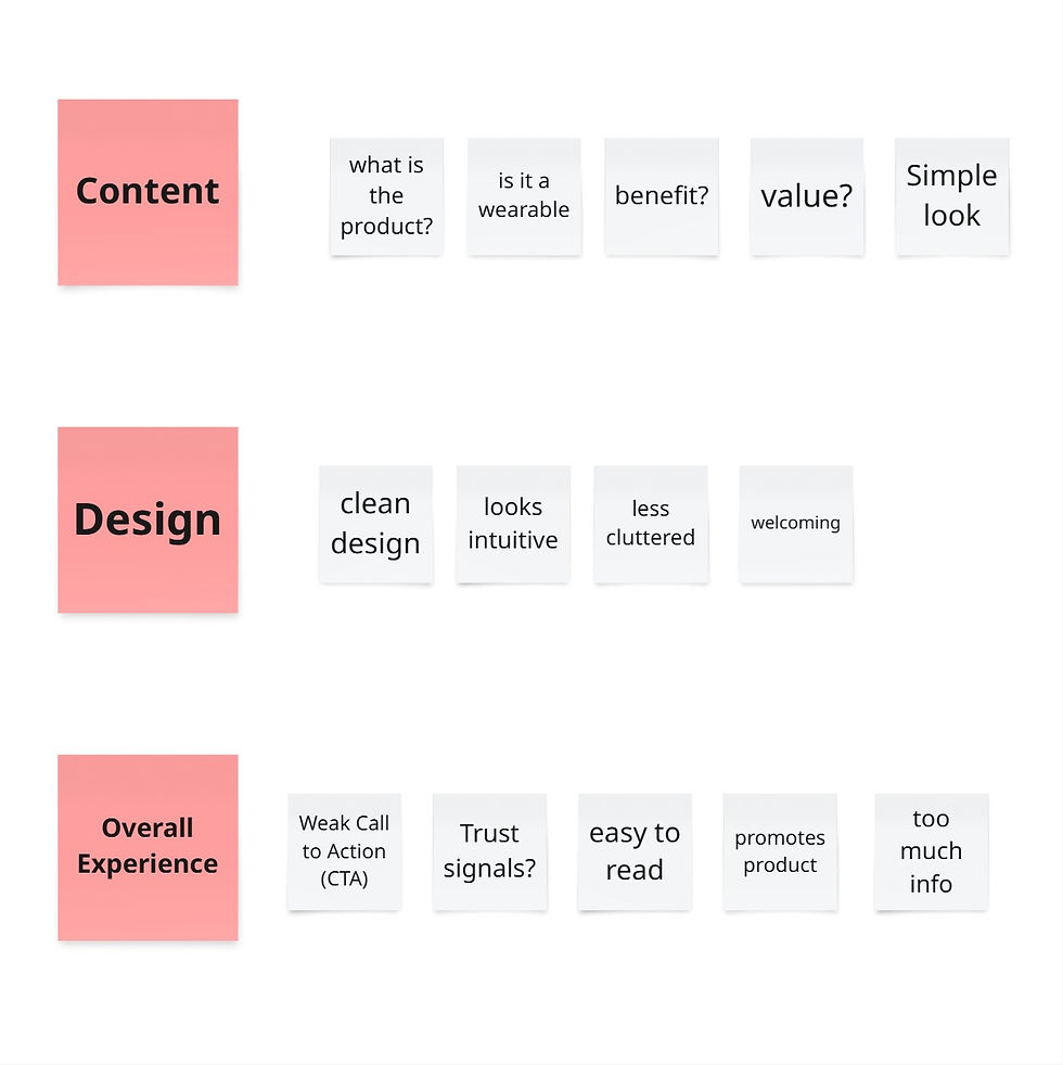
Solutions
-
Focus on clear, concise messaging by emphasizing the benefits of the gadget first.
-
Keep the CTA benefit-focused; telling users what they’ll gain.
-
Highlight testimonials and any guarantees or certifications to build credibility.
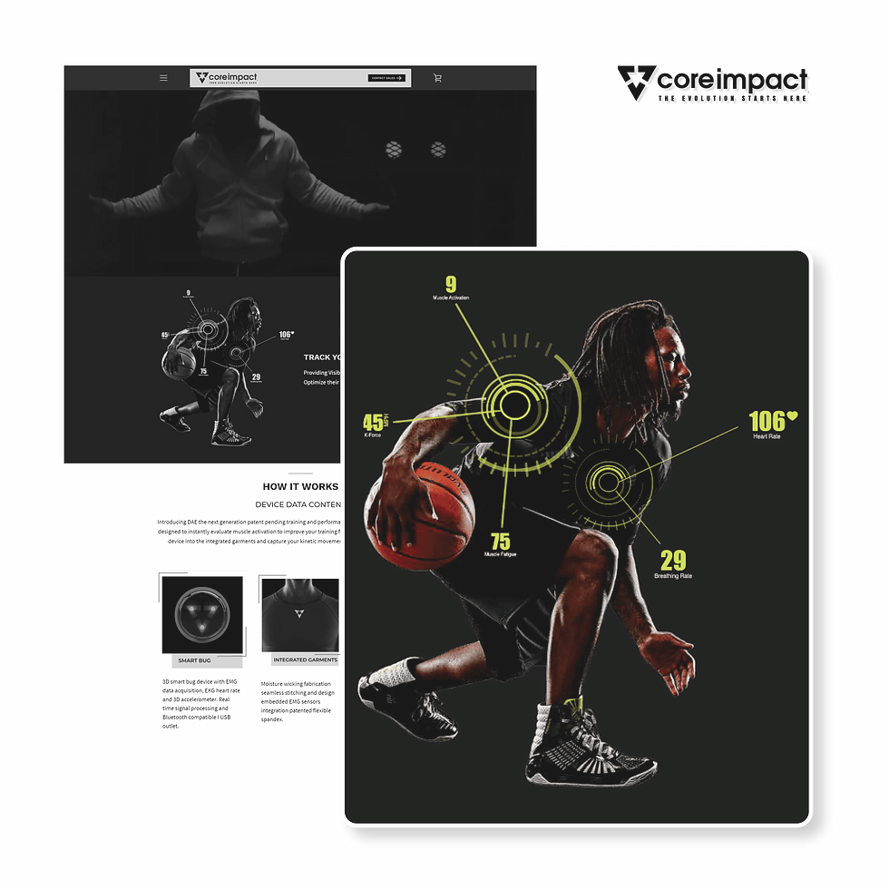
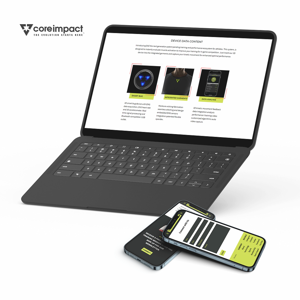
Final Product
Our primary goal for CORE IMPACT's landing page was to promote the product and drive action from the user, like signing up for a newsletter. We made sure the landing page was easy and compelling for the user to take the next step. This was accomplished by providing a clear, focused message that explained what the product is, how it benefits the user, and what steps to take next.


Design Retrospective
We learnt two main lessons from this project:
-
Clear Communication is Essential: We learnt that establishing clear communication channels and regularly checking in was important to keep everyone aligned, and ensure that feedback is shared early and often.
-
Realistic Planning and Time Management Matter: Even though it was just a landing page, breaking down the project into smaller tasks with achievable deadlines, and allowing buffer time for unforeseen challenges was key to delivering the project on time.
