
OVERVIEW
Project type: Creating a website for a Zumba instructor
Role: UX/UI Designer (Project lead)
Industry: Dance fitness
Tools: Figma, FigJam, Zoom, Miro.
PROBLEM
-
Need a seamless, user-friendly website that encourages easy class bookings and interaction with the website.
SOLUTION
Our goal is to build a website that clearly showcases Zumba classes by simplifying the navigation and ensuring key information is easy to find, while also optimizing the mobile experience to make the site fully responsive and user-friendly across all devices.
Marian’s Dream

Dance N TONE
Responsive WordPress website built for a certified Zumba instructor looking to expand and grow a fitness community.

UX UI Design Goal
-
Easy Navigation and Accessibility: Ensure that visitors can quickly find key information and easily navigate the website, regardless of their device or experience level.
-
Engagement and Motivation through Visual Design: Create an energetic, visually appealing experience that reflects the fun and dynamic nature of Zumba, motivating users to take action.
Methodology
UX/UI design methodology is essential for understanding users' needs, behaviors, and pain points to design a more effective, user-centered website.
Prototyping
-
Create Sketches, Mid-fidelity (mid-fi) wireframes, and High-fidelity (high-fi) prototypes to help visualize the structure and user interactions before finalizing the website design.
Testing & Iterating
-
Testing and Iterating the design to ensure it is effective, user-friendly, and aligned with user needs
USER RESEARCH
Objective: Understand Shopify website to design a customized promotional campaign landing page for an upcoming company roadshow.
Stakeholder Interviews
-
We conducted stakeholder interviews to understand the business, target audience, and pain points that need addressing, that included: Business Goals, User Experience, Design, Functionality, and Content.
-
The UI design for your Zumba instructor website should focus on clear and simple navigation, visually engaging and energetic design, mobile optimization, and effective calls to action to create an intuitive and dynamic user experience.
.jpg)
Insights gained
Simple Navigation
Ensure users can quickly access key sections like class schedules and booking with a straightforward menu and sticky navigation bar.
Visually Engaging
Use vibrant colors, high-quality images, and interactive elements to reflect the energetic and fun nature of Zumba.
Mobile
Optimization
Make the website responsive and mobile-friendly, with easy-to-tap buttons and a simplified menu for smaller screens.
Effective CTAs
Place prominent, action-oriented buttons throughout the site to encourage users to book classes or get in touch.
DEFINITION & IDEATION
Objective: Definition and Ideation phase play key roles in transforming the insights gathered during user research into tangible solutions that guide the design of the website

Style Guide
Our team created a style guide to enhance the brand's message and user experience, especially for a futuristic sports performance gadget. The green and black color palette gives off a high-tech, high-energy, performance-first vibe. It is common in sportswear and performance branding and signals intensity, focus, and progression — perfect for a product that helps athletes level up.
PROTOTYPING
Objective: To visualize how the website will work, allowing for testing, feedback, and refinement before the final design is built.

Prototyping - Mid Fidelity
At this stage, our design included more specific details like spacing, typography, and more defined layouts, but it still avoided detailed styling and content. The purpose of mid-fi wireframes was to focus on functionality, usability, and overall structure without getting caught up in the finer visual details.
Test Insights
Findings from the usability testing:
-
Navigation Complexity: The menu might be too cluttered or confusing for users to find important pages easily.
-
Mobile User Experience: The site may not be fully optimized for mobile, affecting usability on smaller screens.
-
Call to Action (CTA) Visibility: CTAs might not be prominent enough, leading to lower user engagement and bookings.


Solutions
-
Streamlined the menu. We used clear labels, and ensured key pages are easily accessible.
-
Ensured responsive design with touch-friendly buttons and easy-to-read text on all screen sizes.
-
Made CTAs more prominent by using contrasting colors, larger buttons, and action-oriented language.
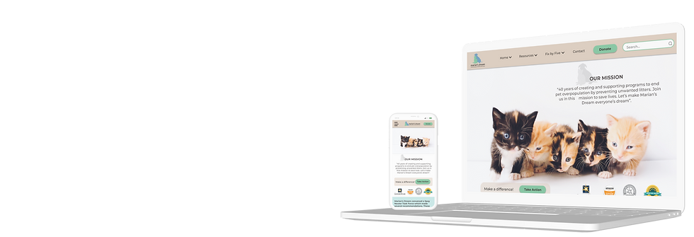
Final Product
The final product provided a user-friendly, visually engaging website that allowed easy navigation, especially on mobile devices. It featured a clear and streamlined menu, ensuring users could quickly access key information like class schedules and bookings. Prominent, action-oriented CTAs drove engagement and conversions, while a vibrant, energetic design reflected the dynamic nature of Zumba. Overall, the site offered a seamless, enjoyable experience for both potential and current students.


Design Retrospective
We learnt two main lessons from this project:
-
Importance of Mobile Optimization: Testing highlighted the need for a fully responsive design, as users increasingly access websites via mobile devices. Ensuring the site is mobile-friendly led to improved user engagement and accessibility.
-
Clear CTAs Drive Conversions: The project demonstrated that well-placed, visually prominent calls to action significantly improved user interaction and booking rates, underscoring the power of clear and compelling CTAs in guiding user behavior.
